When the Fonts Don’t Match on Purpose: A Cover Story

It was morning, and I was driving my daughter to school when the email arrived:
Subject: cover proof
I opened the email immediately. (Yes, while driving.) I didn’t open the attachment. I was too nervous. I handed my phone to my daughter instead.
“Is it good?” I asked.
“I like it,” she said.
“What is it?” I asked, but her description didn’t paint a clear picture.
I waited until we parked in the lot.
What I saw surprised me: a moonlit palette, hand-drawn foliage in silhouette, and a type choice that made me hesitate.
I’ve spent twenty years running design teams.
This makes me the worst candidate for a process that asks authors to hand over creative control entirely.
Regal House is clear: the author fills out a questionnaire, and some weeks later the publisher unveils the finished design. No concepts or mood boards exchanged, no drafts, no iterations. Trust the team. Trust the process.
It was my only hesitation with joining Regal House, but when I signed I told myself I would accept this. I would surrender. I would behave.
Then I sent in a novella-length questionnaire.
I audited trends. Charted my favorite covers. Built lists of motifs and themes. Notes on type choices. I ran a concept workshop at work with a group of enthusiastic designers, and the wonderfully talented Louis Rakovich turned those sketches into a set of five mild-to-spicy concept mockups. All of this went into the questionnaire with linked PDFs. It was a thesis disguised as a form.
I sent it off.
And then: silence.
Weeks of silence.
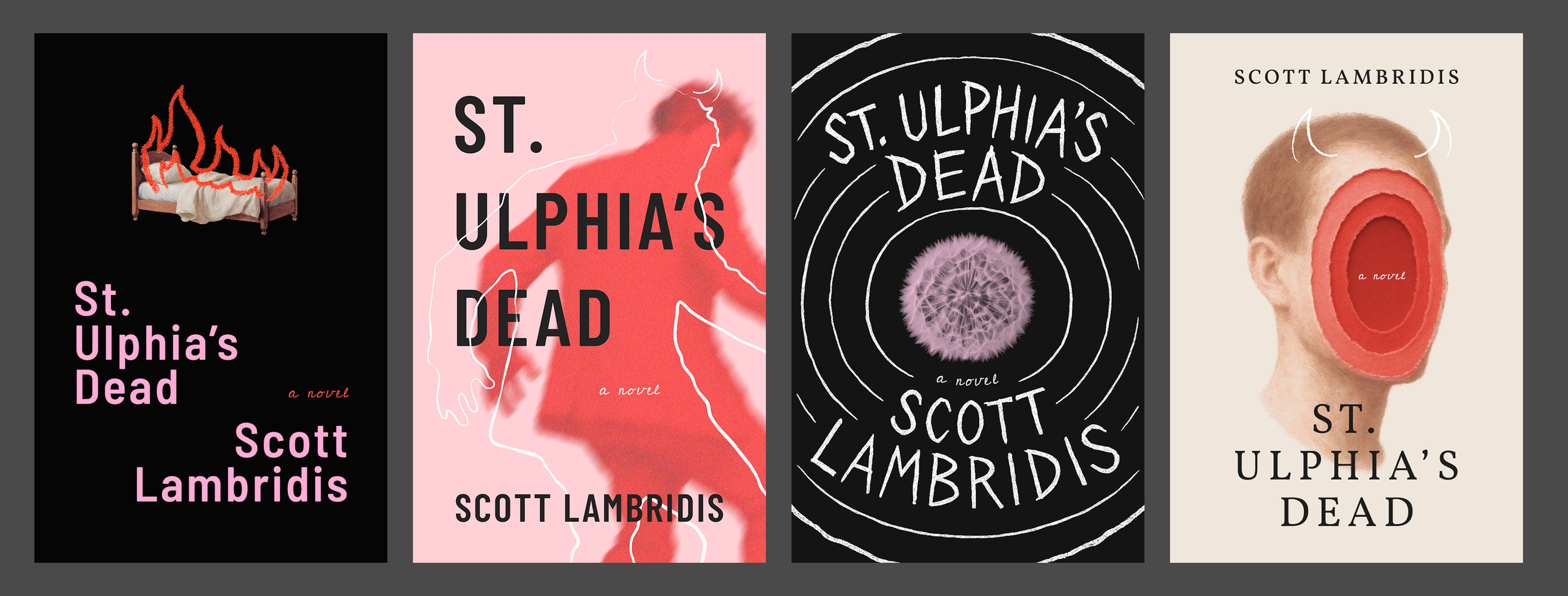
Early “mild-to-spicy” concept explorations by designer Louis Rakovich.
When I finally looked at the cover, I was relieved.
It was good. The mood was right. The title was bold. It felt modern and evocative. The fonts were a bit odd/off though. I showed it to a few close readers, including my closest, Ben Black.
“It’s perfect,” he said, laughing. “Exactly what I saw in my own head. Did they follow your suggestions?”
“No,” I said. At least I presumed no.
I looked up the cover designer: Chiana Royal from Studio Chi. Her covers are fantastic. I could imagine mine among them. But I had to know more, so I asked if she’d be open to an interview.
When I sat down with her, she told me, almost casually:
“I don’t read every book I design.”
I paused. I’d feared this, even if I half-expected it. Regal House publishes around fifteen titles per season. It’s not possible; there isn’t time. Chiana works from questionnaires, conversations with editors, and mood boards.
“There is a disadvantage… not fully having read the book,” she said. “I’m taking a gamble.”
My exhaustive questionnaire (plus attachments) wasn’t overwhelming or overkill after all. It was her way in. Her lifeline.
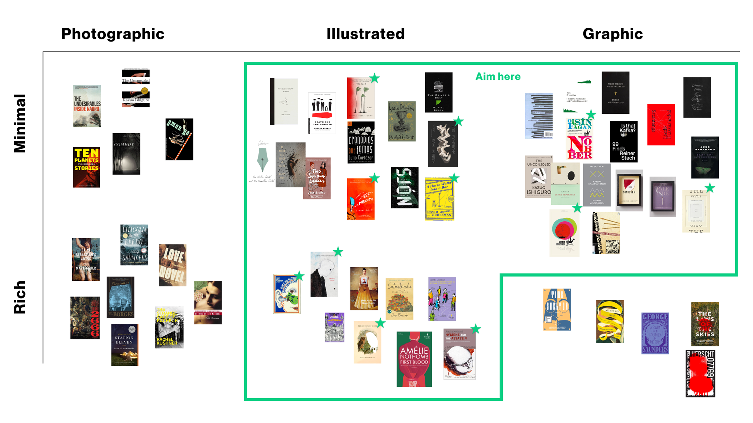
Excerpt from the (lengthy) questionnaire.
Chiana avoids using other books for inspiration.
“I never draw inspiration from other covers,” she said. “I get way more out-of-the-box ideas from runway shows, paintings, and random textures I collect.”
I imagine this is something unusual for cover designers. But she’s more than a cover designer; cover work is an outlet for her love of fashion, fine art, and photography.
She keeps an archive, a sort of private museum, with collected textures, postcards, street-sign typography, colors from movie posters, any scrap that catches her attention. At the start of each project she builds mood board collages from them—three or four per book—each paired with a loose mockup, to review and set direction.

“The moon against black and blue—that was pretty clear early on.”
The direction for St. Ulphia’s Dead came quickly, she said. She also had color constraints in mind: three to four max.
Still, she explored alternatives: island landscapes, characters, animals. But nothing matched the atmosphere she sensed in the questionnaire. And atmosphere was what she was after, not a literal scene.
Her breakthrough came from the painter Peter Doig.
“His art felt like your book,” she said. “That was my click moment.”
Bold, unsettling palettes. Distorted and abstracted realism. A sense of isolation and mystery. Things familiar made unfamiliar.
My strange little isolated island hadn’t just produced imagery. It now had an aesthetic lineage.

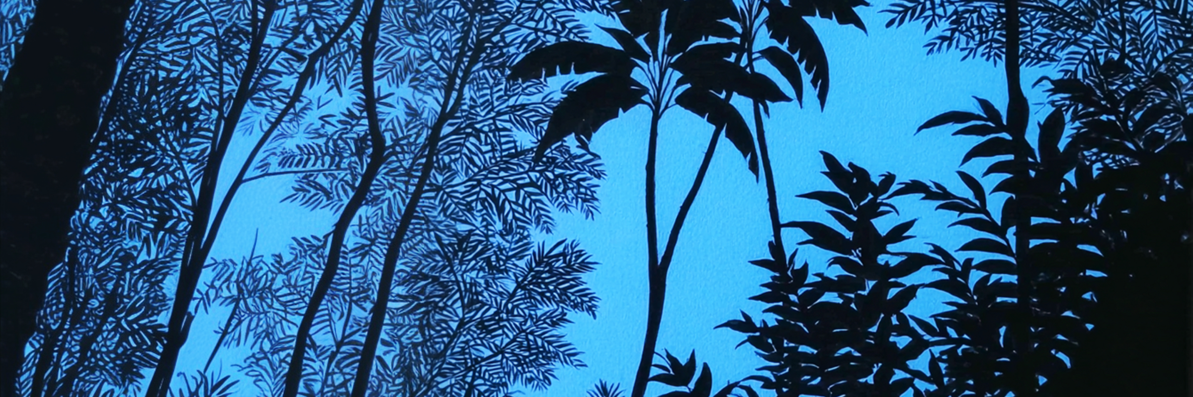
Peter Doig’s distorted landscapes were a key inspiration.
Another surprise came in the form of the background. The foliage isn’t a manipulated photograph. Every leaf on the cover of St. Ulphia’s Dead was drawn by her hand.
“Ninety percent of my covers are drawn,” she said.
I had hoped for an illustrated cover. Magical realism and absurdist fiction thrive on illustration (and I’d highlighted plenty of favorites in the questionnaire). They need that twist of irregularity.
“My hand is always hurting after each season,” she said.
That’s why the foliage feels alive, why the darkness feels textured. Chiana’s effort is embedded in the atmosphere. No AI or stock photograph can capture that humanity.
Hand drawn foliage for the wraparound cover.
Though Chiana and I both tend to distrust our first instincts (as do most good designers) the first image held up. A moonlit palette. Hand-drawn foliage. A title entwined in the thickening black jungle, and an island that feels both beautiful and wrong in the right way.
It was when she brought up the title typography though that I really leaned in.
When I first saw the cover, I’d squinted. The fonts were different, but not different enough. I’d wondered if it was a mistake.
“I used three fonts that look almost the same,” she said. “It adds that indirect element, so you feel something a little… off.”
That’s when it struck me.
The cover wasn’t just representing the story. It was performing it.
The slight dissonance in type echoed the book’s central theme: what’s real versus what’s imagined.
Chiana didn’t ignore my questionnaire. She took the ideas and guidance as inspiration, but made something authentic to her own sense of the book. It turns out surrendering control didn’t mean disappearing. It meant offering clarity and trusting another artist to translate the story through their own lens, and bring it to life in unexpected ways.
Book cover design is not product design. A cover can only do so much. It suggests tone, signals genre, and above all creates mystery. It’s an invitation.
Here’s my moonlit, slightly dissonant invitation.
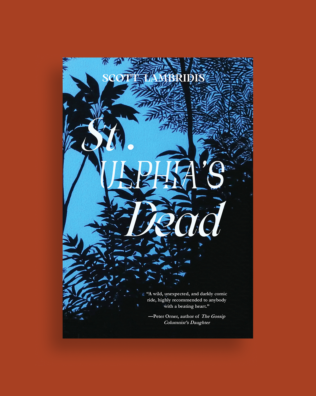
The final cover of St. Ulphia’s Dead.
👉 Pre-orders are opening mid-December. Subscribe to the newsletter to get early access and perks!